Here at our condo, my craft area shares a space in the front bedroom. Our little grand daughters had toddler beds there for the last year and we just recently changed those out in favor of our day bed which has a pull out trundle bed that pops up and makes a king (or two twins.) We leave the trundle down low for the youngest grand daughter and have guards on the bed sides since they are not used to the smaller twin size.
Anyway, the above is a photo of my two craft tables as they used to be. The beds are in the second photo after we flip flopped them with the tables. My extra bins are not in the room yet (there are about 6 of them and I carry them back and forth to MN so I have the basics with me where ever I go. It is a pain to do, but necessary since I can't afford to own duplicates of all my supplies.)
My hubby has recently put together the two cabinets we are installing so I can put away some of my craft supplies and make it all be more organized and easier to find things. I'm still working on HOW to organize it all but it will eventually be a vast improvement. Besides the two tall cabinets, I have 5 of those 14 inch cube storage units from Michaels to place in the space between the wood cabinets and the table. (The two bins will be emptied and so the cubes will have easy access.) The cubes are all different...one has four 6 inch sq drawers 14" deep, one has three wide drawers 14x14 each, one has a wide shelf and one drawer, and the last two are just 4 shelves each that will hold 12 x12 card stock and big paper pads easily. They still need to be put together. I may put the 2 paper storage cubes inside a cabinet to keep the light off of my paper. Wouldn't want any of it to fade. LOL Lastly above the tables we are adding 4 or 5 9" shelves the length of the wall in wood tone where the punches will go and other items
that are used often. The pink-lidded bins on the corner of the table have Stickles, embellishments, and other add-ons for my cards and will probably go inside the wood cabinets or at least on the open counter section. I am so excited to see my new crafting space emerge. I think it is so fitting to have a new space for the new year, don't you? Happy 2010 to all. : )
In each of us is the true essence of who we are and I call that the "Heart Within".
Monday, December 28, 2009
CHRISTMAS EVE
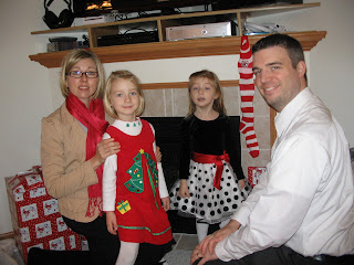
'Twas the night before Christmas and the family gathered together in Oshkosh. Here is our son Bill, his wife Jodi, and the GRAND girls, Emma in the red and Matti in the black/with a dotted skirt. We enjoy them all so much. God has blessed us with our two children and our son's family and we are very THANKFUL. We missed Beth not being able to come this year but understand the requirements of her new job in TN. May God continue to bless us, provide for us, and protect us as we look to the new year as His servants. Happy 2010 to all.
Wednesday, December 23, 2009
PINK EYE!!!
Here I am 67 and I am having symptoms of pink eye! I must be going through my second childhood! LOL Our youngest grand daughter caught it at daycare. Matti was telling me "her friend had three blue eyes". Now you might ask what she meant to say and after questioning her and Emma helping translate, she has three friends who have the "pink eye". (Why she changed the color beats me.) And now her Mamaw is showing some signs of it too. So I made a trip to the doctor and he gave me a script for the drops. It is OK as I wasn't going anywhere over the holidays anyway.
Thought you'd like to see the two cats who have relationship issues. Mari, our white cat, just doesn't warm up to Jack, the stray we adopted more than a year ago. But they occasionally call a truce and get close to each other. She tolerates him mostly. Luci plays with him late at night running back and forth. You'd think our "herd of elephants was on the move" when they run. But it keeps them active and fit which is a good thing.
Monday, December 21, 2009
TWO DOWN
YIKES! Here it is Dec 21st and I've only sent out two Christmas cards. I made two alike and sent to my two new friends in the UK before I headed to TX to visit mom. I met these two gals reading their blogs on line and asked them if they wanted to be pen pals and they both said "Yes". Beryl Tyler lives in Wales on the side of a mountain near the sea coast and Ann Dunlop has a B & B and lives in Ayr, Scotland. Wales and Scotland are two of my fav countries, having visited them in the mid 90's. I love meeting people from other countries. Humankind has so many characteristics that are alike. I disagree with all the "diversity" language and emphasis. When you focus on diversity, you just keep people separated more. We should be focusing on our likenesses, which would give us common ground to enteract together and enjoy each other. But what do I know. Sometimes I think I do have a bit of common sense that helps me see the broad picture.
Here is my Christmas card that I sent across the pond to the UK. The base is white CS, the red is from Archivers and I used the Martha Stewart snowflake punch to put the row of flakes top and bottom. I stamped the PSX Christmas Door image in Momento black ink on white and used Su markers for coloring the tree, the brick steps, the wreath, the sled and the cardinals. I bought three Copic markers: 2 grays (C3-cool grey and B60-pale blue grey), and a really light blue (B 00-frost blue) I used the two shades of grey on the door and house, and around some items where I wanted to indicate shadows or a deepening color. The light blue I used to color the mounds of snow and added a little grey there too. I then used my glue pen to add some large iridescent glitter that is hexagonal pieces. It is just the coolest glitter for snow. I stamped "Merry Christmas" in red on the inside with a clear rhinestone for the dot of the "i"and added the sheer ribbon on the front. Simple card and I hope to get the rest of them done for my family before Jan 1. I am usually late, so they don't expect it until they see it coming. : )
I have a little project to make with Matti and Emma. We will crush some peppermint candies, and add to melted white candy coating, and will spread it out thinly to cool. Then we will break it up and put some in small cellophane bags, and will add a red/white striped card stockstrip over the top, and make a little card with a candy cane on it. I bought a red copic (R27) to use for the candy cane. Simple enough for the girls to do with my help, and they can give to their teachers. Three more days till Christmas and I have finished the girls gifts. Bill is a problem since his birthday is the 29th of Dec so I need two gifts or one big one (for the man who buys his own gifts usually!) I have so many new stamps and other things, I really don't want anything more for myself. Well, I would love to have all the Copic markers (Hehe!) but can wait until next year for my birthday maybe. I just love the way they color!
So to all, near and far, I wish for you the very happiest of
Christmases. May you be blessed with God's peace, joy and love. He is our creator and we were made in His image. May we all honor and love Him for who He is and appreciate how He takes care of all things in His timing and to His purpose. We do not know the future, but we know who holds the future. Thank you heavenly Father for sending Jesus to be the Savior of mankind, if they would only believe.
Sunday, December 20, 2009
RECENT CARDS
Just before my trip to Texas I did finish up some cards. I was still doing cards that expressed "Thanksgiving". The first was still in Autumnal colors which I just love using, but almost southwest looking because I used the SU medallion from (I think) Baroque motiffs. Tell me what you think about it. I originally wanted a plaid ribbon for this but there was none to be found in my stash or at the three craft stores I went to. SHEESH! Makes a crafter get a little grumpy.
So I went back to my creating place, and decided to use a plaid paper under the diamond. I was determined to use plaid in some way and the paper was from JoAnn's. I used a cream colored card base. The rust solid CS I stamped with the flourish from SU Baroque Motiffs with Momento black ink. I matted everything with black CS. The vertical beige print is punched with the Martha Stewart Arched Lattice punch and I left the left edge of the black matting a little longer on that side to balance the other heavier side on the right. The center medallion was stamped on a cream CS with Versa Mark and sprinkled with black Fun Flocking which makes it look like velvet. Now I'm gettin' happy! The sentiment is an SU one from one of their all year greeting sets (can't remember which at the moment.) The ribbon is a cream sheer from Wal-Mart and the sentiment is popped up to give some dimension as is the medallion. Then I added some warm jewels in an orangey/gold color to the top right corner and around the diamond for some bling. Since it was after thanksgiving when I got the card done, I am WAY AHEAD for next year. Haha!
This next card was going to be for a challenge and it has been a month since I made it and OOPS! Can't remember which challenge, so will just post it. Now that I think about it, it might have been for one of the color throw downs but for sure can't remember the #. I think I was to use Old Olive, Bermuda Bay, with black and white. My card base is white and I wanted to try my big Martha Stewart punch with the large holes in the scallop (Too bad that Martha doesn't give you a label in the package when you buy them!) I believe it is called Garden Scallop but since I am not sure, you'll just have to look it up. Maybe I will make me a notebook of the names and punch the design across from them so I can remember better! I sure am saying "I don't remember" a lot in this post. LOL!
Anyway, I used an olive green, a turquoise blue, and a print (which has more blue than shows in the picture.) I matted the whole with black and each layer became the mat for the next one. Each row of the punched design was matted in black separately since the design didn't show up as well on each color. Using black behind each row gave a bit of "color and shape alliteration"and I cut around the edges to show them off a little. I tied on a skinny black sheer ribbon, and stamped the "Thanks" in black Momento ink, matted that in black CS and popped it up. The punched edges became the focal point and I felt it did not need any other image.
My last card in this grouping is actually a larger Matchbook gift card holder. (Sorry about the head shadow in the photo.) I wanted to send a folded check and so made this about 4" wide. I folded the red up from the bottom making a 1 1/2" strip. I punched that edge with a MS scalloped embossing punch. I felt the scallop mirrored the edges of the holly and the three little dots looked a little like berries. The top edge was folded down to fit into the bottom. The PSX image of holly and berries was stamped in Momento black onto white CS and colored with SU markers and the whole image, was matted in
green and got a layer of red glitter gel pen over them. Inside I added the PSX holly and berries TO and FROM. To keep the top flap shut, I added a strip of red double sided tape
right at the bottom of the folded bottom flap inside.That way the bottom flap provides the
resistance keeping the top flap inside until you lift it. Hope you can see in the pictures what it looked like. This is such an easy way to make a gift card holder, or even send a photo. I love this Red Pepper Linen CS from Archivers as it was very stable to score and fold and added a little texture. Enjoy!
OLD FRIENDS
Recently I was able to spend a wonderful 4 hour "lunch" with two friends from high school. Jim Bailey sat two seats ahead of me in home room and has always been a good friend and a great servant to others. He was my "JB taxi" this trip down to TX to see my elderly mom. Thanks so much, Jim. You are a sweetie pie! Frani Bickley was a neighborhood friend and we visited each others homes. I can still remember her lovely mom and dad. As we ate the great Mexican food served at Los Barrios, and the names, and remembrances and the hours ticked by, I was struck by how many moments we share with others during our lifetime. We don't often get to go back in time and remember together. But we did on this day and talked nonstop, almost.
My 50th High School Class Reunion comes up next year. I graduated from Mary Carroll in May 1960, and the reunion will be in October in Corpus Christi, TX. I hope I am able to go down there and revisit with so many classmates. It would be so much fun! I am thankful for this short little prelude visit with these two beautiful people. God bless you both.
Wednesday, December 16, 2009
COPIC CERTIFIED DESIGNER
WOW! It has been a month since I last posted and a lot has happened. (I will try to catch up on posting my recent cards later today.) As some of you know, we spend our time between our home (of 23 yrs) in Apple Valley, MN and our condo in Oshkosh, WI (where our son, his wife and our 2 precious grand daughters live.) Usually it is about a month here and a month there scenario. The travel time is 5-6 hours depending on our stops.
We came back to MN the middle of November, had a quiet "ham" Thanksgiving, just the two of us, and on Dec 3rd, I left for New Braunfels, TX to visit my mom who is 88, widowed a little over a year now and still trying to live in her home. I enjoyed my 10 day visit and also reconnected with two HS classmates and had a 4 hour lunch with them at Los Barrios Mexican restaurant in San Antonio. (I bought the cookbook the restaurant was selling and hope to try some of their dishes at home.) They were named one of the top 100 restaurants in America and have been on Good Morning America, Food Network, and the Today Show. It was a memorable place with excellent food. Thanks Jim Bailey for a lovely lunch. You are such a sweetie!
The next day (after spending the night in the Airport Double Tree), I attended the Copic Certification class with 26 other ladies. I was thrilled to have been accepted for this class. WHY you might ask? Well, it is usually reserved for people who are designers and design team members, craft store owners and their employees, artists, art educators and other art professionals. I don't quite fit the "professional artist" category but I wanted to learn exactly HOW best to use them in my card making and possibly other applications. To make a long story short, they had so many applicants for the Dec 13th class, they made a second class and my degree in education and art, and my having taught art at a Junior High for a year, and teaching card classes for Seniors was enough to be invited to attend the class. AND I was going to be in the vacinity anyway visiting Mom. Funny, how things work out sometimes. So I AM now a Copic Certified Designer and I am SO happy about it that I have a perpetual smile on my face. I learned SO much about all their products, and techniques and my brain was full to the brim with information that I hope to utilize in my cards. Sally Lynn McDonald was a fantastic presenter...so knowledgeable and funny, too. She is a wonderful representative of the nice people I met during class. I also met Carol Condos, owner of Stamp Antonio who gave me a ride to her store at lunch. What a great stamp store and kind person she is. She even sent someone out to pick up my fav burger for lunch while I shopped a little, and we shared a little about my cats and her dogs over lunch. Thanks, Carol.
AND to top it all off, I came home that evening (after a foggy departure), to a winter wonderland. Woo Hoo! We had 8 inches of snow while I was gone and here is a picture of our home nestled in the white blanket of beauty that God provided. Oh, He is SO good to us, if we only had eyes, and ears, and hearts to listen to Him and a desire to appreciate Him. Thank You God
Friday, November 13, 2009
EASEL CARD WITH STITCHING
Crazy4Challenges issued a challenge to make an easel card (#10)and I combined it with the stitching on C4C card challenge #5. I hope they don't mind I am combining some so that I can catch up. I am such a slow poke some days. But we had an early Thanksgiving dinner with family in Oshkosh this week, and that took a little time since I really cook everyday.
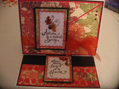
My easel card uses the same Paper Studio leaf paper I've used for my last 3 cards which I just love and may even make another card with it before I am finished. : ) I used the brown umber and then red as matting. On the card front I cut the leaf paper into quilt pieces and used faux stitching around the leaves and edges. I found cutting the quilting pieces to be difficult because they HAVE to line up to look correct. I tied on the red/orange sheer ribbon which goes so well with this paper. The sentiment is a long vertical one and I masked off the parts I didn't want for the top. and then for the rest on the bottom. Make sense? This is such a sweet sentiment, "Autumn is a second spring when every leaf is a flower". I matted "Autumn is a second spring" with umber, leaf paper and red behind the white CS, stamped with Momento black ink. I colored the oak leaves with Stampin Up markers and popped them up over their place on the card, and covered them with Glossy Accents.
The bottom of the card was covered with umber brown. I cut a strip of the red and added it over the brown. Then I cut a little smaller piece of the leaf paper and punched it on both sides with the Martha Stewart leaf punch. This provided the "stop" for the card front. The sentiment on the front is a little to the left on purpose and the other half of the sentiment on the bottom is centered to draw the eye from left to right. The bottom sentiment is also matted in umber brown, leaf print, red and the white CS that has the stamped last half of the sentiment. There are also colored oak leaves that are covered in Glossy Accents. I added three little stick-on nail heads in rust for a little bling. I really enjoyed making this style of card and hope to crank out a few more for Christmas before the new year rolls around. LOL Only42 shopping days till Christmas, and there are 48 days till 2010. I guess I'd better get busy since I take my sweet time! Thanks for stopping by. I appreciate your comments and encouragements.
JUMPING IN LEAVES
Love these little House Mouse stamps. This one of a mouse jumping into a pile of leaves is so adorable and fun to color. Paper Studio leaf paper matted in brown, Martha Stewart leaf corner punch, Stampin Up markers used to color the mouse and leaves. Fun Flocking on the mouse to make him fuzzy, fussy cut and matted with the umber brown and popped the mouse and leaves up for dimension, finished with a red/orange sheer ribbon at the top.
The second card is the same design, but I added a striped sheer wired ribbon behind the mouse and leaves , and left off the Fun Flocking on the mouse. Has anyone used wired ribbon on cards? This is my second and it is OK and there are some lovely wired ribbons out there to play with. : )
REDO
I made a quick card for my friend Davi and I don't know why but it was a struggle that day, and I was not happy with the outcome. (You can check back a posting or two and see the other one.) SOOO, I made another on a different day and reworked it, and am now happy with the design.
This one I left the umber brown showing on the outer edges vertically, and added a leaf in umber brown and a sheer red/orange ribbon and bow which seems to finish it better. What do you think?
Thursday, November 5, 2009
MORE MICE
I just LOVE my House Mouse stamps. They make me smile and giggle and lift my spirits as they play, and enjoy the day doing whatever mice do best, which is getting into everything.
I really like how this card turned out. The image is a bit "naughty" but gets across the idea of surprise. I have really liked this streamer/confetti printed paper for a long time because it has lots of colors so lends itself to different applications. I need to find some more to keep in my stash for when they quit making it.
I matted the two verticals and the image in lavender and dark purple. Before I matted the image I was going to do it as a rectangle but the slope of the image gave me the idea of fussy cutting it out on top and leaving the bottom squared off. And I think that turned out pretty well. Before I stuck anything down, I wanted to figure out where to put some ribbon or embellishments. While shopping at Hobby Lobby (Boy do I like to look around that store!), I found a striped wider ribbon that was wired. No, I have never used wired ribbon on a card but the colors were perfect. I cut a piece an inch wider than the card on either side and attached the ribbon with red double stick tape (that you can't move after it is down), on the outer side of the left rectangle. I placed it and then proceeded to tape the second rectangle, being careful that the ribbon was just long enough to go across the front of the card and would not have excess at the edge. The wire actually helped give the ribbon some stability and was left in. It took a little adjusting, but I got it down, and popped the matted image over the ribbon.
I did not have a stamp that said "surprise" so just hand-wrote my own and matted it with the two shades of purple. I added 3 tiny rhinestones at the right corner of the image and one for the dot of the "i" in the sentiment. On the inside it says, "Happy, Happy, Happy Birthday". And I am happy, happy, happy with it. Thanks for stopping by and taking a peek.
Wednesday, November 4, 2009
OUR LITTLE FAIRIES
We took care of the two grand daughters for Halloween. We had been Trick or Treating in the morning at the grocery store and we got some shopping out of the way at the same time. What a deal!
In the evening after supper, the girls played in their fairy costumes while watching the Tinkerbell movie. It was cold out when we got ready to Trick or Treat at night. They just wore all of their "pink" outer wear and I called them my "Pink Patooties". We only went to two houses and they took their little "poodle purses" as their bag for candy. Here is a pictorial of each in their fairy costumes and Emma telling Matti a "fairy secret"! Too cute, even if I say so myself!
MORE LEAVES
I am NOT finished with Autumn yet. I have so many ideas for using leaves and some of the Autumn stamps I have. So bear with me as I play my way through my ideas. I promise I will be done before winter is officially here. LOL
I just finished up a BD card for Davi. Now I am going to admit that when I started it, I had no idea what I was going to do where or with what. I picked the leaf paper by Paper Studio and it had a cream background, so that required a cream card base which I normally don't use. But white just wasn't going to work!!! I then auditioned several solid colors of card stock for matting and chose to use the dark chocolate brown which accented the fall colors best. I decided to try out my new Martha Stewart leaf corner punch. It leaves a little border and punches out the maple leaf which then shows the matting underneath and leaves you with nice maple leaf cutouts to use somewhere else. : ) I wasn't sure where to go from here.
I stamped a few images and tried them out but nothing "rang my chimes". It took forever and I finally stamped a simple sentiment on a deep orange and matted it in a the dark brown and stuck it on the front. It needed something on the outside edges because I had cut the leaf paper a little short. I started adding some gold down the vertical edges. My pen malfunctioned and I wound up coloring in the gold leaving a small border of the deep chocolate brown. The gold really doesn't show the true color in the picture but it is all alomg the vertical edges. It might have been better if I had left the gold off and let the brown show down the sides. I just don't know! I couldn't even figure out where to put some ribbon or embellishments. It looked better in person but still lacking!!! I must have been in a fog or something. BUT it has been mailed and I am not sure what else I should have done or could have done different. But here's the picture and maybe you can suggest something so I can learn for next time. I welcome constructive criticism. Thanks for stopping by. Happy birthday early, Davi ! You ARE the best friend and SIS!
I just finished up a BD card for Davi. Now I am going to admit that when I started it, I had no idea what I was going to do where or with what. I picked the leaf paper by Paper Studio and it had a cream background, so that required a cream card base which I normally don't use. But white just wasn't going to work!!! I then auditioned several solid colors of card stock for matting and chose to use the dark chocolate brown which accented the fall colors best. I decided to try out my new Martha Stewart leaf corner punch. It leaves a little border and punches out the maple leaf which then shows the matting underneath and leaves you with nice maple leaf cutouts to use somewhere else. : ) I wasn't sure where to go from here.
I stamped a few images and tried them out but nothing "rang my chimes". It took forever and I finally stamped a simple sentiment on a deep orange and matted it in a the dark brown and stuck it on the front. It needed something on the outside edges because I had cut the leaf paper a little short. I started adding some gold down the vertical edges. My pen malfunctioned and I wound up coloring in the gold leaving a small border of the deep chocolate brown. The gold really doesn't show the true color in the picture but it is all alomg the vertical edges. It might have been better if I had left the gold off and let the brown show down the sides. I just don't know! I couldn't even figure out where to put some ribbon or embellishments. It looked better in person but still lacking!!! I must have been in a fog or something. BUT it has been mailed and I am not sure what else I should have done or could have done different. But here's the picture and maybe you can suggest something so I can learn for next time. I welcome constructive criticism. Thanks for stopping by. Happy birthday early, Davi ! You ARE the best friend and SIS!
ANGELS
Every parent thinks their kids are the cutest, smartest, etc, etc, etc. Every grand parent thinks their grand kids are the cutest, smartest, etc, etc, etc. Why is that?
Do we see a reflection of ourselves in our kids and grand kids and in our "humble opinion" they must be like us? Or do we see qualities and characteristics we wish we had and knowing our lacks, desire better of them, for them?
Not sure which it is or if it is the Creator giving children of all races, creeds and color certain looks, smiles, eye sparkle, expressions, etc that reflect Him. Their laughter is infectious. We love them so much and they bring JOY into our lives.
Here are our two little angels. Emma in the pink hat and Matti in the white.
Tuesday, November 3, 2009
Jacques Fab Celebration Candy
Here is a quote from a very talented card maker who is celebrating some blog milestones and giving away some great candy to a lucky winner.
"I am celebrating my 6 month Blog Anniversary and I am so happy and humbled that I have had more than 58,000 visits and have more than 340 Followers!! Thank you so much to each of you!!! So I would like to give you an opportunity to win a Holiday Package from me which you see below!!! " http://jacquesmagnolias.blogspot.com/
Wednesday, October 28, 2009
SIMPLE AND ELEGANT
My card for this challenge (from a few weeks ago and I don't even remember who's challenge it was) is a simple black and white with red as an accent. I used a solid fleur de lis stamp by Hampton Arts, stamped in versa mark and sprinkled with red tinsel embossing powder. I then took a clear stamp set of fleur de lis that has three different fleurs and each is in three different sizes. It came from Hobby Lobby and was a bargain for sure. Using Momento ink, I stamped different fleurs around making my own black and white CS. I used the SU ticket punch on the corners of this CS and matted in black only but I made it almost 1/4" wide. I added the shiny flat dots at the corners (but they don't show up! Grrr) I stamped "You're the best" with a red tinsel line under "best" and matted in black and popped it up. I didn't use any ribbons, or other embellishments or multi layers of matting because I wanted to keep it simple. LESS IS MORE (and cheaper too!) Inside it says "When I count my blessings, I count you twice" and it is from Stampabilities 2004. Hope you enjoy it. Thanks for stopping by.
RESTING
Because our lives are hurried most days, it is good to relax and have down time, when we let go of our worries, cares, and responsibilities. Trying to find time is often difficult. Finding TAG time (Time Alone with God) is a struggle, too. We hear of those really good Christians who get up early to pray and read the Word to "set the sails for their day". This would be ideal as this act of faith bathes the whole day with the Spirit. We are fresh and rested and our hearts can "hear" the leading of the Holy Spirit better than when we are at the end of our day and maybe at the end of our rope. Our worries weigh us down more in the evening, and it is harder to muster up the Hope we have in Jesus. When we give Him the "leftovers" of our time, and maybe none at all, we are robbing Him of our friendship and we rob ourselves of His presence. We are not offering Him the "first fruits" of our time. We would get up early to get the kids to school, to make a flight, to go shopping the day after Thanksgiving, etc. Yet having a sustained intimate relationship with our Lord is so hard for us to accomplish. I struggle with it and I know others do too. "I know to do right and doeth it not."
We are called to "rest in Jesus" which gives us peace as only He can give. So I encourage all to find/make time to be with the Creator, the one who sustains us, provides for us, and who loves us more than we will ever know or understand.
My little card is a Penny Black Hedgie stamp. (I apologize for the out-of-focus image. I will try to redo that!) I painted this one using my Twinkling H2O's. In side it says "Have a wonderful day!" and that is my prayer for you, that you be blessed by God.
Wednesday, October 21, 2009
FOREIGN LANGUAGE
YIKES! Little did I know that to do a blog, I would need to learn a "foreign" language...computer language! I know what I want to do and how I want my blog to look, operate, etc but I can't seem to put it into words my DH can understand to be able to accomplish my goals. He is my computer expert and learns how "to do" in order to teach me. He is easily frustrated when I don't describe what I want in language he can understand. : ) I know I should be the one doing the doing, but I am technically/mechanically challenged and when taught, need to do it a few times before I "know how" and if I don't keep doing it on a regular basis, I forget a little. Well, OK, a lot! Lately it seems I have done nothing but learn about how to work on my blog and I NEED to get back to creating cards which is a lot more fun anyway. Anyone out there have similar difficulties?
Monday, October 19, 2009
BEGIN AGAIN
We all are on our own personal "treadmill of life". We make choices that impact our future choices and the direction our life will take. THIS is a very scary thought for the young if they were smart enough TO EVEN THINK ABOUT IT! (And some are.) But most just go through their lives making choices and never consider what the future will bring them BECAUSE of their choices. Recently I have met some young girls who have had several children but the fathers have not stayed around. The young mothers are trying to do the best they can but have little life experience or education/training to be able to earn a living or to raise their kids. They still are in the process of learning who they are as women and often make immature decisions and are reckless. They don't understand how necessary personal discipline is to us all and they have made messes out of their days with no end in sight for the future. No wonder teen and young adult suicides are at or near the top of the list. Most do not know Jesus personally to have a hope in Him and what He can do in their lives.
Where are their parents? Where are the adults who help mentor and guide them spiritually, physically, emotionally? Have we fallen so far away from being good parents to our children as God intended us to be? Did we miss out on providing them with strong morals and character so that when they do make a few bad decisions, their whole life isn't ruined in the process, and perpetuated into the future in their childrens lives?
I believe everyday IS a new beginning for each one of us. We can choose to be different and choose goals that will move us in a better direction than where we have been. We don't have to wallow in our messes. Our HOPE is in the Lord Jesus and He alone can cleanse us, help us find a new direction and help us to become the person He intended when we were created. How wonderful to know He is always there, always able, and always truthful in what His Word tells us to do. No one comes to the Father but through Jesus. He will never let us down and He is forever our friend! What a blessing to know Him no matter what condition we find ourselves. We are to be "imitators of God". Ephesians 5
PRINCESS COMPUTER CAFE
We are back in Oshkosh at our condo and had the grand daughters for a day-and-a-half Sat-Sun. A good time was had by all and I sleep like a rock after catching up. A WIN-WIN situation as I see it. I like to keep occupied. Of course I didn't do much stamping, but we had a super time out at Perkins (Pancakes for supper is always fun anytime!), and we watched a couple of Disney movies and went to Sunday School and church on Sunday. When their mom and dad (our son) came to pick them up, we all had a big bowl of home made chicken noodle soup which warmed our tummies, some sides and pumpkin pie for dessert. Here is a picture of our two grand daughters dressed up in their princess dresses playing on our two small, kid friendly netbook computers. We have a Winnie the Pooh soft ware on there and they both can practice their numbers and do the shapes and games. I guess you could call it our Princess Computer Cafe. LOL! They sure have fun learning and it is a joy to see what they can do. Emma at 4 1/2 years is the most comfortable but Matti (3 1/2 years)likes the games and is learning too. Can you imagine how comfortable they will be with computers and the technology of the future. It blows this old lady away just thinking about it.
Wednesday, October 14, 2009
FALL HOUSE MOUSE
My card is a House Mouse fall image. These little critters are having so much fun and I thought it would make a great birthday card. I colored the image with SU markers (I don't have Copics YET!)I mounted the image a little off center on purpose. I used Umber and red CS for mounting. I fussy-cut the top row of mice out because I didn't like the look of white sky. I am not sure I like the red "sky" but it is as it is.
I used three colors of embossing powder on the leaves ( Zing copper glitter finish, red Embossing Tinsel, and Goddess Gold Embossing powder by Antique Gold) I also embossed the little word "Celebrate" in the red. The sparkle of the embossing powder does not show up in the picture as well as in real life. I wrapped a piece of orange/red (it has two colors) sheer ribbon around before mounting and tied a bow. I added a shiny gold leaf brad to the saying and popped it up by the bow. Inside I stamped "HAPPY BIRTHDAY" in red using a wood mounted stamp but it has no name at all on it. So I have no clue.
The mice are coated with Fun Flocking in brown and feel so real. I guess that is why I have such a huge collection of House Mouse stamps. Their antics are so cute and make me smile every time I see them. I brought over some Christmas-themed House Mouse stamps with me this trip to the condo, so be looking for some of them in the next few months.
Monday, October 12, 2009
WONDERS
God provides us "wonders" to behold every day if we would just open our eyes, ears, hearts and lives to Him.
Today HE sent a beautiful, fresh, clean white blanket of snow to cover our area! HOW ABSOLUTELY GORGEOUS it is! I just love it!
Many view "snow" as a horrible substance that they can not deal with and so they live south somewhere or if they can't move, they grumble and murmur a lot. I wonder if they "embrace" their days with the same negative attitude.
Today I was told by a medical professional that I project happiness and joy, that I smile a lot and he asked the reason for my happiness. I told him that I feel happy inside. I shared that I am a Christian and knowing Jesus gives me joy and a security that is found no where else.
I don't claim to have all the answers, or have a perfect life...far from it!. But I know that I KNOW that I KNOW my creator and that HE alone has saved me and has washed me white as snow and forgiven my sins. AND I wouldn't trade what I have with HIM for anything in this world. Thank you Lord for the wonders you provide everyday to enrich our lives and to confirm your presence.
Friday, October 9, 2009
COPICS
I have been hearing about Copic markers for about a year or so. My friend Barbara Hardeman was the first who shared what they were. And as I have added more and more blogs, Copics are just about the "only" marker used by most card makers and they always get rave reviews. I was not even sure where to get them because my local craft stores did not carry them until recently. I have learned that they were considered an "artist medium" and mainly used by animators and sold in "art stores" until they crossed over into crafts. They are pricey for one marker, running $6.50-6.95 each and there are (at this time) 325 colors. Some of those shades are greys (which can have blue undertones, pink undertones, green undertones and so on.) Greys are very important when trying to color an object and create shape on a flat surface. Copic markers are able to do that using the many shades of a color plus the greys for shadows. The image literally jumps off the page because it looks like the real thing, with reflected light.
So being the cautious "informed" shopper that I am (LOL), I took a class called Christmas Copics at my Apple Valley Archivers craft store. They just added the Copics to their shelves. I had a blast as usual and made four cards as usual, with three using the Copics. Copics are alcohol based and so will bleed through on the usual card stock. You need a light "hand" coloring with them and a heavy or different CS. The ink you stamp the image with needs to be of a certain type so that the markers don't run or you can "dry" your inked image using a heat gun, which is what we did. Some gals use Gina K card stock or Cryogen White from Eclectic Papery which doesn't bleed (I am told). Most gals use Momento ink with the Copics.
What I like about them is that they are guaranteed for three years, they have two tips which are replaceable, they can be reinked when needed if you buy the refills, and they color beautifully, and can be blended using the clear blender pen. The alcohol ink stays wet long enough when you put it on the card stock to be able to blend one color with another! One gal at the class said, "They spread like "buttah"!
They are sold in sets of 12, 36, 72 ( and maybe other combinations such as color groups, or seasonal groups, etc.), there are several kinds of Copic styles. I have found them as cheap as $4.89 each when you buy a set or more on line and usually have free shipping then too.
So someday, I hope to add these wonderful art "tools" to my equipment. I am planning how to store them so that they can be used easily. Each marker has a colored end to the cap, showing the shade and a number to identify the color. With so many, that will come in handy. The photos are of the three cards I made in class using the Copics and I hope my Santa makes you laugh! Enjoy
COLOR
What if we lived in a black and white world, devoid of color, and the variations color and light cause? DH said there is a good explanation of color or caloure in Wikipedia and I won't go into all of it. Please read it, as it is amazing how our eyes work and are able to see light frequencies and all of it works together to produce the phenomenon called "COLOR" that enriches every moment of everyday for those who have eyesight.
I am challenged to look around me at what all God has provided me to see daily. The beginning of our personal worship of our creator is having an attitude of "thanksgiving" continually. As I have seen the beauty in the changing leaf colors, it amazes me what a little cold temps can do to change the color of leaves over night almost. Autumn is an amazing time. Thank you Lord for the beauty you provide us to enrich everyday, for our amazing eyesight which does so much for our day and allows us to "see" what you are doing in the physical world. We are blessed beyond measure!
Monday, October 5, 2009
BLOG CANDY
Hey, all you card makers. Here is a wonderful collection of some really nice BLOG Candy found at this address HERE.
Sunday, October 4, 2009
UNEXPECTED
I know it is trite, but it IS true...Life is what happens when we are expecting something else.
My pastor and his wife's oldest daughter, her husband and family had an unexpected passing of their 4th child ( 6th grand child). She was a full term still born delivery due to a cord problem. I felt so much sympathy for them as we also experienced a still birth at 5 1/2 months gestation of our first child 39 years ago. There are probably many others who have had similar experiences. We expect a living healthy baby, but God is the potter and we are the clay. Our children are his creation as are we. When things happen like this, we must look for the lesson He may be teaching us, for the change of direction in our life, for the difference we might make in another's life for having gone through such sad times. All things are meant for His Glory.
My sympathy card for them uses bright and cheerful colors. I used a Bazzill CS called Hopi, and then a little check paper from a pad called Itty Bitty Pads backgrounds in primary colors by Provo Craft. (A Michaels purchase a few years back.) The peach loop lace is a generic paper scrap punched with Martha Stewarts new loop punch. I ran a sheer white ribbon down the center if it, but did not put a bow as I thought it would look too "celebratory." The sympathy sentiment is from Paper Inspirations 2005, and is stamped with SU Really Rust on white generic CS, matted with Hopi and Saltillo rust Bazzill scraps. I punched all corners with my Creative Memories scalloped corner punch. I pop dotted the matted sentiment up as well as the little Hampton Art butterfly which I had stamped using the SU Really Rust and Summer Sun. I cut it out and raised the wings with small dimensional dots and added an orange jewel for the butterfly's head and added Glossy Accents to the wings.
I hope my sympathy card inspires you to reach out to someone in your life. There are lots of hurting people all around us if we but open our eyes and hearts. We are called to be ministers of His love and care.
Saturday, October 3, 2009
LEAVES
(OOPS! I did this card thinking it was for C4C3 and it is for the C4C4 Challenge using Cindy Haffners layout. So mine will be out of order for a little while but HEY, I am just learning! Maybe my DH can help me figure out how to move it when I get C4C3 finished and posted. We figured it out and it is NOW in the right order. )
For C4C4, I decided to do something with leaves and fall colors. I went to my local JoAnns and Archivers and found two different papers with leaf prints. I picked the brighter one with yellows, reds, and orange.
My base card is white, with chocolate as my first mat. (I have to admit here that I am not a lover of brown...I don't wear it and don't use the color in my art very often. But this is the third card in a row where I have used brown and they all seem to require brown as a mat. So guess who has to go back to the store for more brown CS? : ) I then added a layer of Bazzill Imperial yellow that has a rough woven texture and used my corner rounder on the upper right corner only of the brown and yellow.
I took the leaf paper which was cut to fit over the mats and I tore off the upper right section, using the leaves as my line so that they would look natural and like they had just fallen onto the card. Because I always make two cards using the same design (one to keep and one to give), I realized with the second card the "hole" left when I tore away part of the leaves would be different from card to card. But they both are acceptable and I proceeded. I adhered the brown mat, the yellow mat and leaves to the base and then added a narrow strip of the Bazzill woven CS in a color called Roasted Pepper. (LOL, reading the names of the colors sometimes makes me hungry!) I used my Cropodile to punch a hole through the strip and other layers and added a brad from the new Basic Grey Indian Summer collection. It is a nice deep rust color. I had saved the torn out leaves and you may not see it too well but adhered them in the lower right corner. I took a little artistic liberty instead of making it square like the sketch from Cindy Haffner. With everything adhered to the base, I felt it needed something, and pulled out some fall colored eyelash yarn from Cello called Sensations that I picked up at Wal-Mart when they were cleaning house and discontinuing a bunch of craft items.
The saying is part of a stamp from Hero Arts and stamped in Momento black. I did not use the small leaves that were above and below the words on the stamp as I felt it detracted from the whole. The line near the saying is a stray fiber from the yarn. I didn't see it when I took the photo and I apologize for my camera skills. They are minimal at best. I have included a picture of my second card also so that you can see the subtle difference between. I believe in keeping cards simple, using the "negative space" design element to advantage and letting the paper give "direction" for what goes with it. I was a school teacher and did a lot of bulletin boards and posters in my day, and I feel leading the eye to the message or image is what my cards are trying to accomplish, not cluttering the card up so much that the eye doesn't know where to look first. I guess you can call this my "philosophy" of design.
Come along and see what you can do with this layout. Enjoy!
GOD IS...
SHEESH! I am such a turtle in getting my cards made! I have worked on this one card ALL week. No, I don't work outside the home, and NO I don't have a bunch of progeny to care for all day (unless you consider my three cats and DH as progeny.) I am a 67 yr old ROMP ( retired, old, married, person ) and I just made that up! LOL
My card for C4C3 evolved from the NEW and WONDERFUL Basic Grey Indian Summer CS. I love all the prints and decided to use the Autumn Glaze print. I remembered a background stamp I had purchased a few years ago from SU called Leafy Glade and the leaves in it looked similar to the CS and also a Martha Stewart leaf spray punch I used to punch the brown leaves. I had to go to my local Archivers and find the right shade of golden yellow CS to do the embossing with Zing Copper glitter Ep. For matting and solid CS, I used a Bazill brown, rust (Saltillo), and golden yellow called Peanut Butter (Honest!) I added a length of sheer orange/red ribbon vertically and put the three golden jewels in the upper right corner. I just didn't like them under the sentiment.
The sentiment is from SU called Strength and Refuge. I only stamped the first two words in SU chocolate chip ink on my little home made tag in rust. The rust CS had a woven texture but the "God is..." stamped clearly. I added the brown leaves and the golden yellow paper flowers from Michaels. Inside I finished the sentiment which is a Scripture from Psalms 46:1,2. The card base might have been better if I had used a cream CS. but I softened the edges with Tsukinekos "Wheat' Dew Drop ink.
Thanks Cindy for wonderful layouts for these first four. I will try my best to keep up now that I have caught up (almost!) These four have all included brown in some way and I am stretching my artistic experiences. I almost never use brown, or wear it. So this is a "Good thing", right!
Enjoy!
Monday, September 28, 2009
PRAYER
I am submitting this as my card for the C4C2 Challenge and for the Stampin Sisters in Christ DT Call.
Prayer, a necessity for every Christian. So many times in our lives we just don't know what to say or what to do to encourage and lift up another who is grieving, hurting, and facing such hurdles in their lives that seem insurmountable. We have the power of prayer and as the card says, it is often the only "gift " we can give another. And it should be the first thing we say or give them.
I chose to do Cindy Haffners sketch from Crazy4Challenges2 for my card. It is pretty simple looking but I learned sometimes simplicity is harder than covering everything with 15 layers , 6 embellishments and a huge bow.
My card has a white base, SU Chocolate Chip and Tempting Turquoise for the mats. The top squares are a turquoise print from My Minds Eye called Bohemia-Damask Teal. After cutting the squares and trying to layer them straight (my GRRR moment), I used Versa Mark to add an SU flourish from Baroque Motifs and glittered with Martha Stewarts turquoise glitter. The glitter looked great but as I turned each piece over to add the dot-runner adhesives, the glitter rubbed off on my paper towel. So I went to plan B and used a Paper Crafts Pin Point roller glue pen and drew all the flourishes over and glittered again and it stuck. Whew! The image is from Embossing Arts '93 "Sometimes prayer..." that I bought on ebay. I used the same SU Chocolate chip and Tempting Turquoise ink for matting the image. I used the SU ticket punch on the corners of the image and added flat Color Box turquoise metal dots to the cut-outs on the corners. I used a sheer white ribbon from Wal-Mart and tied a bow. I used pop dots to raise the center square up over the ribbon.
One of the surprises of this card is that the four squares being separated a little from each other created the shape of a cross : ) and that made me very happy. After all, we are to be a witness in all we do, and say, and think. We are citizens of another kingdom and our Heavenly Fathers children. What a wonderful family we belong to and we need to share His love in every way we can. Prayer Works!
Subscribe to:
Posts (Atom)